Information Architecture:
Navigation Redesign
Redesigning the navigation hierarchy for an enterprise financial reporting platform
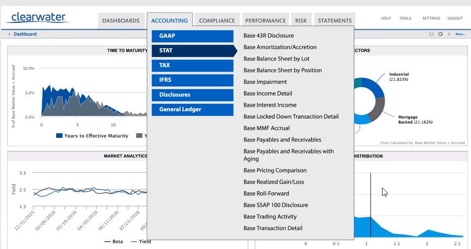
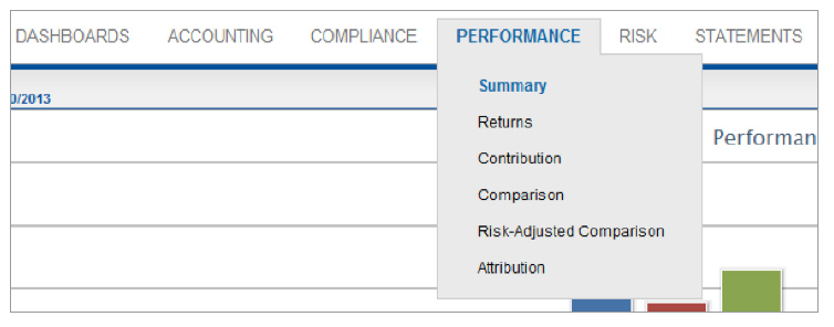
This enterprise financial platform offered thousands of possible reports, and most users had between 20 and 100 reports shown in their navigation menus. Business plans called for additional categories to be added, but the menu layout was already inflexible and outdated.
After bringing my team along on the design journey through check-ins and presenting early designs, I got feedback from the developers and product owners I was supporting and evaluated some of their pre-existing ideas.
As a new member of the front-end team, I worked to establish a good working relationship with developers and demonstrate my willingness to explore and validate any idea that might work.
I also explored some new ideas that came up during brainstorming sessions, but which I found to have some deficiencies.
My final design allowed more efficient discovery of the various reports available. It ensured that the layout wouldn’t be overwhelmed by adding new categories in the future, and it kept the menus at the top of the page where users expected them.
The final implemented version, with some additional page design updates to match a re-branding visual refresh.
I started by doing an audit of the current information architecture, and built out an understanding of the various customer types and which categories of reports were important to each.
I met with stakeholders in product, sales, and customer account management to understand their perspective, and point me to specific clients that could tell me more of their experience.
I summarized my research to indicate which reports were most frequently used, and how users navigated the existing categories.