UI Design:

Financial Analytics Dashboard

Visual refresh and experience design for a financial platform

Existing reports in this financial analytics platform were visually outdated and difficult to read or navigate.

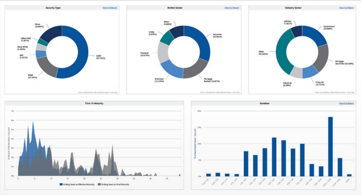
The final implemented version shows the completed dashboard with improved layout, updated color and branding, and a variety of useful chart types.

Six charts in a dashboard: three pie charts and three bar charts displaying data related to security types, market sectors, industry sectors, time to maturity, and duration.
Collection of analytics reports displaying bar charts and pie charts with data tables from Clearwater.

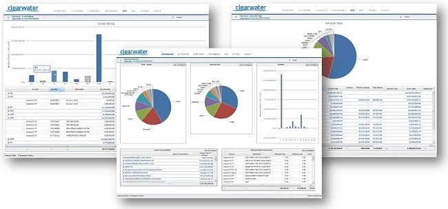
My initial wireframe shows ideation for improving the dashboard with cleaner, simpler and more accessible visuals as well as clearer navigation and configuration of the dates and settings.

Financial dashboard showing account details, balance sheets, and expense asset and security class charts. A date filter and calendar are open for selecting date ranges.
Financial dashboard with charts showing time to maturity, duration, issuer concentration, and industry sector distribution, with a welcome message and user login options at the top.
A bar chart showing market sector proportions over time, with categories like Agency, Asset Backed, Cash, Financial, Government, Industrial, Other, and Utility